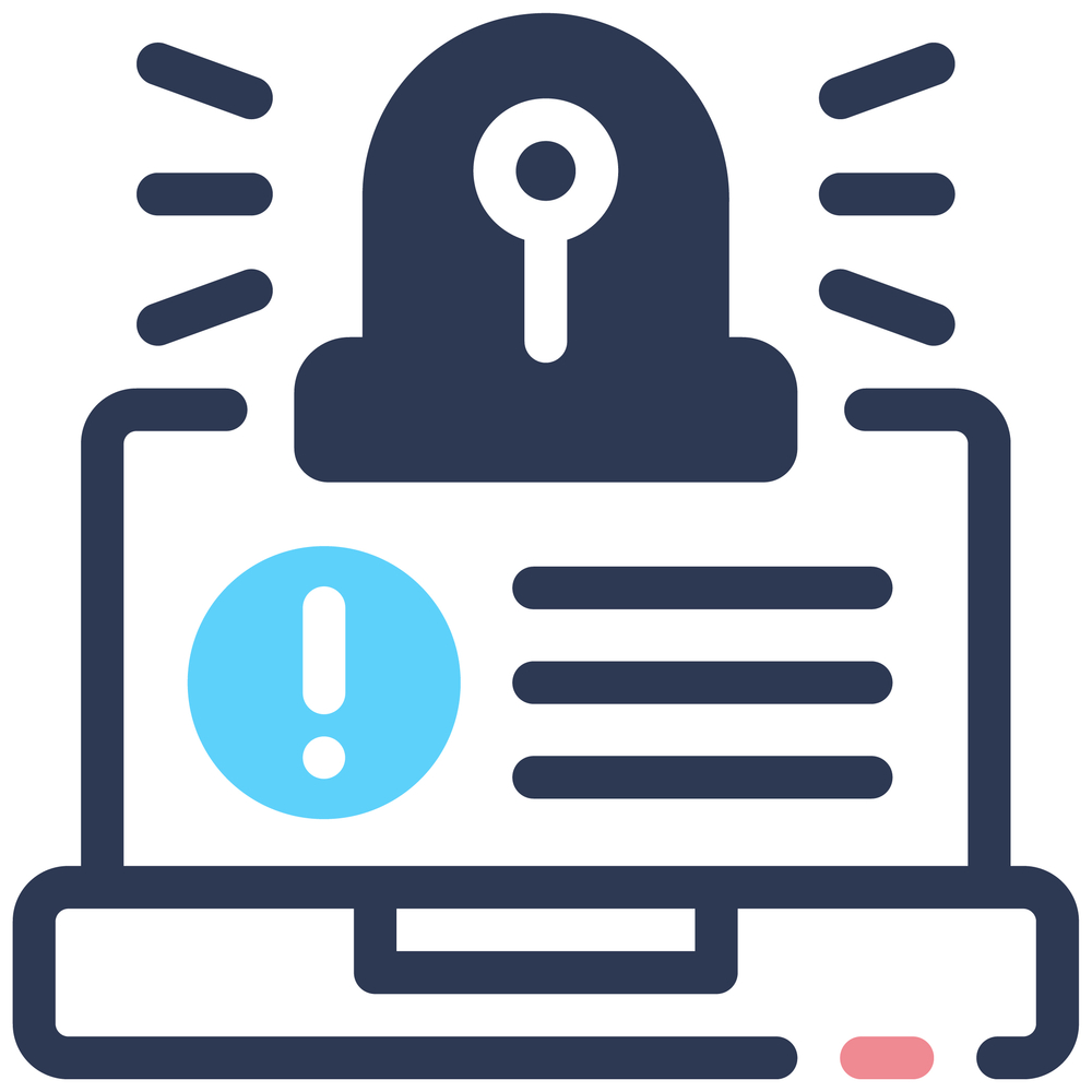
 Dark patterns are a cybersecurity risk.
Every click you make online is shaped by design. Some of that design helps you, but some of it quietly works against you. Dark patterns are one of the clearest examples, and they are becoming a growing concern in cybersecurity.
This is not just a design issue. It is also a cybersecurity risk.
Dark patterns are a cybersecurity risk.
Every click you make online is shaped by design. Some of that design helps you, but some of it quietly works against you. Dark patterns are one of the clearest examples, and they are becoming a growing concern in cybersecurity.
This is not just a design issue. It is also a cybersecurity risk.  Dark patterns are design tricks used on websites and apps to guide people into doing things they did not want to do.
In simple terms, a dark pattern is when a digital service makes it confusing or harder for you to make a fair choice, like signing up, paying, or leaving a service.
They are often used to:
- Make you sign up quickly
- Stop you from cancelling easily
- Get more personal data from you
- Keep you subscribed without clear consent
In the article, Communications of the ACM, research shows dark patterns are user interface designs that can steer or manipulate user behaviour in ways that may not be in the user’s best interest. It could be something as simple as getting a phone number then using it to market to you without your consent.
 Dark patterns work because they rely on how people naturally behave online.
Most people:
- Skim text instead of reading every detail
- Click quickly through screens
- Trust that buttons are fair and clear
- Feel pressure when time limits appear
Designers of dark patterns use this to change the behaviour of the person viewing the page.
Common tactics include:
- Confusing buttons like “Yes, continue” vs “No, I want to lose benefits”
- Fake urgency like countdown timers
- Hidden fees added late in checkout
- Extra steps to cancel subscriptions
- Wording that guilt trips users into staying
For example, unsubscribe links might be hidden, or cancelling a service may require multiple pages and confirmations. These designs are meant to slow you down and make you give up.
 People with disability are more impacted by dark patterns than the “normal” person.
This is closely linked to disability fatigue, which means people with disabilities often have to spend extra time and energy to complete basic online tasks.
When systems are already harder to use, dark patterns become even more harmful.
Key reasons include:
- Complex layouts increase cognitive load
- Screen readers can make confusing pages harder to follow
- Low contrast or small text hides important warnings
- Long or multi-step processes increase fatigue
- Time pressure messages can create stress and confusion
When someone is already working harder to access a system, it becomes easier for a manipulative design to influence decisions without a clear understanding.
This is why accessibility is also a cybersecurity issue, not just a usability issue.
 Here are common examples you might see online:
 Dark patterns are not just frustrating. They can create real security risks.
They can lead to:
- Sharing personal data without clear consent
- Signing up for services that collect more information than expected
- Losing control of subscriptions and payments
- Clicking unsafe links that look legitimate
- Giving away sensitive information through misleading forms
Reports show these patterns are common across major apps and websites and can affect financial and privacy safety. (UniSA)

Here are practical ways to protect yourself:
- Slow your decision-making: If something feels urgent, pause before clicking.
- Look for the exit first: Before signing up, check how to cancel or unsubscribe.
- Avoid pressure messages: Be cautious of timers, warnings, or guilt-based wording.
- Read the final step carefully: Check totals before paying or confirming anything.
- Go direct instead of clicking links: Visit the official website instead of email buttons.
- Review subscriptions regularly: Check what you are paying for each month.
- Use accessibility tools: Reader mode, zoom, and screen readers can help expose hidden design tricks.

Dark patterns show how design can influence behaviour in powerful ways. When combined with cybersecurity risks, they can affect privacy, money, and trust online.
Understanding them is the first step to avoiding them.
Better design makes the internet safer for everyone. That includes people with disability, where clear and accessible systems reduce fatigue and improve safe decision making.