Making Documents Readable For Everyone

Page displaying a list of tasks with all ticked making documents readable.

Making documents readable by creating  clear, easy-to-read documents helps everyone to understand the information that is being provided. However, for people with dyslexia or dysgraphia or other issues such as autism, structure including format can make a big difference. These conditions affect reading and writing in different ways, but both can make everyday tasks more challenging. Especially when information is presented in confusing formats. There are simple document techniques that can help.


2 Overlapping circles where the word, Facts, is in one circle, Beliefs in the second and Knowledge where the circles overlap.

What Are Dyslexia and Dysgraphia?

Dyslexia is a learning condition that makes reading, spelling, and understanding written words harder. People with dyslexia often find it hard to read quickly, recognise common words, or understand long paragraphs.

Dysgraphia affects writing skills. It can make it difficult to hold a biro, form letters, or organise thoughts on paper or screen. It’s not about intelligence. People with these conditions are just as capable as anyone else. They just process words differently.

A hand pointing to the words User Experience. User TEsting

Document Structure Matters

A well-structured document is easier for the brain to process. For people with dyslexia or dysgraphia, the way text is presented can either help or hinder their understanding. Good structure reduces stress, improves reading speed, and supports memory and focus.

Whether it’s a report, form, newsletter, or website, using clear structure shows respect and care for your reader.

Person typing on a laptop with icons of different tools floating above.

10 Top Techniques

  1. Use Headings and Subheadings

Break your content into sections with clear headings. Use a larger font or bold text to make them stand out. This helps readers know what each section is about and makes it easier to scan the page.

Tip: Use Microsoft Word’s built-in “Styles” for Headings 1, 2, and 3. This also helps screen readers and improves accessibility.

  1. Keep Sentences and Paragraphs Short

Shorter sentences are easier to follow. Aim for one idea per sentence, and only 3–5 sentences per paragraph. Avoid big blocks of text. They are overwhelming.

Tip: Break big paragraphs into bite-sized chunks. White space gives the eyes a rest.

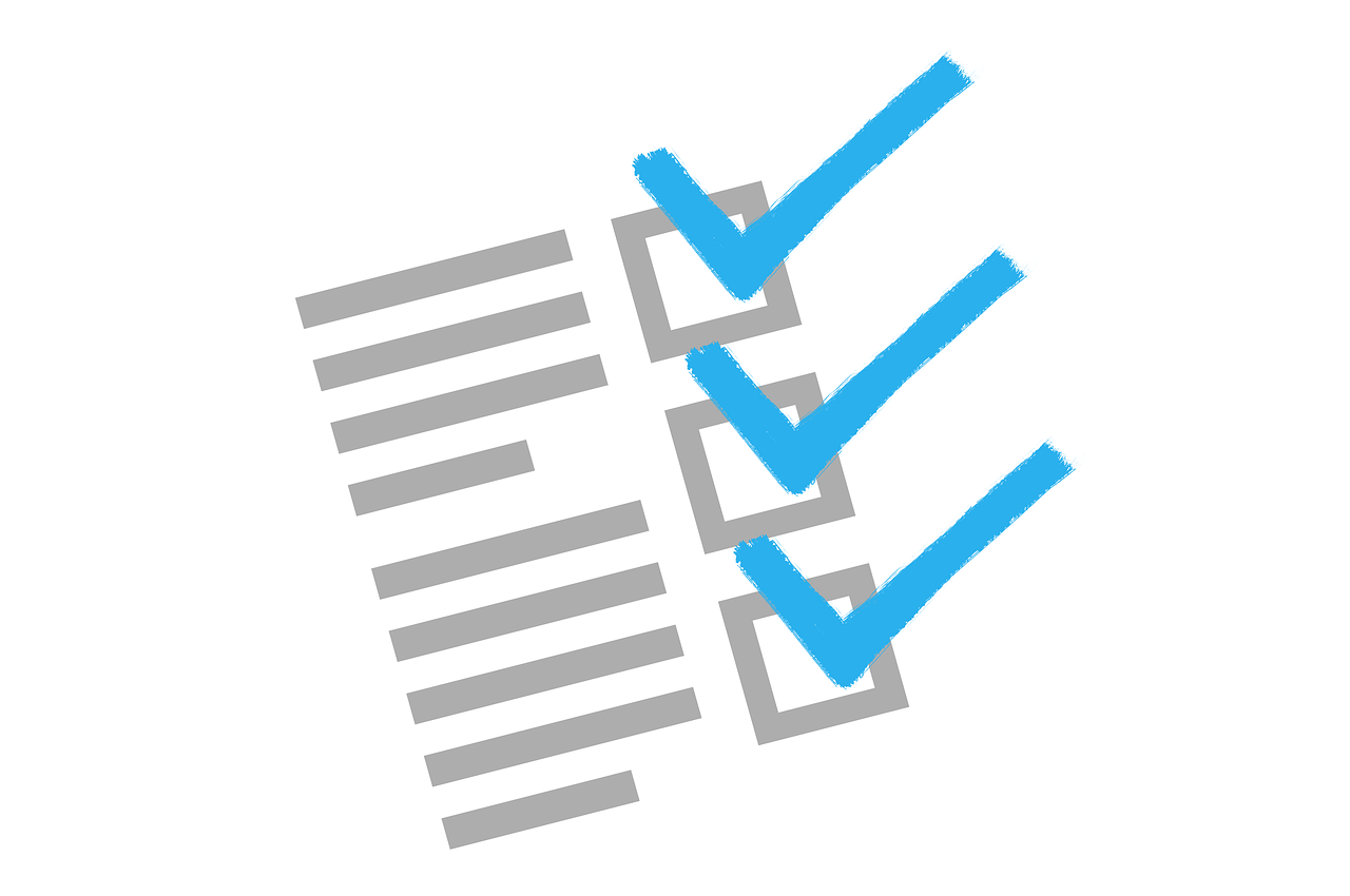
  1. Use Bullet Points and Numbered Lists

Lists are easier to scan than dense paragraphs. Use bullet points for steps, features, or ideas. Numbered lists are great for instructions or when order matters.

Tip: Leave space between list items. Don’t crowd them together.

  1. Use Clear Fonts and Larger Text

Some fonts are easier to read than others. Avoid curly, decorative, or squashed fonts.

Best fonts for readability:

    • Verdana
    • Tahoma
    • Aptos
    • OpenDyslexic (a free font made for people with dyslexia)

Use at least 12-point font size for body text, and larger for headings.

Tip: Some people prefer dark text on a pale yellow or soft blue background — not bright white.

  1. Use High Contrast and Avoid Busy Backgrounds

Text needs to stand out. Black or dark grey on a light background is best. Avoid writing over photos, patterns, or gradients.

 Tip: If using coloured text, test it for contrast using the WebAIM Contrast Checker.

  1. Avoid Italics and Underlining

Italics can blur letters together. Underlining can make words look like links. Instead, use the built in Strong style for emphasis.

Tip: If you need to highlight something, use a heading or bold the key phrase.

  1. Left Align Your Text

Always left-align text. This means each line starts in the same spot, which helps readers track from line to line. Fully justified text (lined up on both sides) creates uneven spaces between words and is harder to read.

Tip: Avoid centring long text blocks — it’s fine for titles but not for paragraphs.

  1. Add Images to Support Text

Simple images can explain ideas better than words alone. Diagrams, icons, and pictures can help make meaning clearer.

Tip: Always include a caption or brief explanation of the image. Don’t rely on images alone.

  1. Use Clear Language

Use plain, everyday words. Avoid jargon, big words, or long-winded explanations.

Tip: Run your text through a readability checker. Aim for a Year 9 reading level. You can use Hemingway Editor or Microsoft Word’s built-in tool.

  1. Provide Alternatives

Offer your content in more than one format — for example:

    • A short summary at the top
    • A downloadable PDF version
    • An audio version or video

Tip: Use tools like Microsoft Read Aloud or screen readers for those who need to listen rather than read.

Disability Advocates are Change makers. The word, Changemaker, is on the spacebar of a keyboard.

Real-World Impact

Using these techniques doesn’t just help people with dyslexia or dysgraphia. It benefits everyone by making documents readable. Students, workers, and everyday people will all appreciate information that’s easy to understand.

If you’re designing documents for the public, it’s part of your legal and ethical responsibility to make your content accessible. Following these simple tips is one step toward meeting the Web Content Accessibility Guidelines (WCAG). You can learn more about these rules from the W3C Website.

You can also read more about inclusive communication practices at DASAT.com.au.

5 Superwomen with disability and being independent

Final thoughts

Good document structure is not just about looking professional. It’s about showing respect to all readers, including those who learn and think differently. Whether you’re writing a school newsletter, workplace document, or public service flyer by making documents readable, keep it clear, simple, and structured, because everyone deserves to understand the message.

How do your documents stack up — are they easy to read for everyone?